Volume 2
Data Viz and Presentation
By Millie O. Symns in R
October 30, 2022
Continuation
It has been a long and busy month, but here we go back again with some R tips and tricks! I am enjoying this series. 😁 Since it is the fall time (in the U.S.) and the start of basketball season, it would be nice to use that as an inspiration point for the post today. All the tips will come from me using a random dataset from Basketball Reference, but the scenarios and tools should apply to any data center work regardless of the topic.
Highlight
My heart goes out to Brittney Griner, a gold medalist as a member of the Team USA from the 2016 Olympics, a two-time gold medalist FIBA Women’s Basketball World Championships, a six-time WNBA All-Star, Two-Time WNBA Peak Performer Award Winner as the league’s leading scorer, and so much more, and her family. Someone as decorated as her and has been in the pros as long as she should not be in a position of taking other jobs elsewhere to keep up a living. The sociological layers of race, gender, sexuality, war, and politics intersect regarding her story and case, which is unjust. This article lays out the topic and how to help get Brittney Griner home. #BRINGBRITTNEYHOME
Data we are working with
The dataset for these scenarios comes from Basketball Reference on the 2019 WNBA season per game stats. This season, Brittney Griner was the WNBA Peak Performer Award Winner as the league’s leading scorer with an average of 20.7 points per game.
Scenarios
Just like last time, I have listed some real-life scenarios you may or may not have found yourself in from time to time. To try it out for yourself, you can find all the scenarios in the github repo.
Scenario #4
You are doing some data exploration and are curious about comparing where groups fall along a continuous metric. At this point, you want to see the general frequencies and get a sense of what the data looks like to inform you of your next steps in the analysis.
The before times
When I wanted to get a sense of the data shape, I would start by creating summary tables and then plotting histograms. I would plot individual histograms or make mini-histograms to look at them all on one page. Here is one example of code on how I would do it:
ggplot(wnba_2019_per_game_stats, aes(x = x3pa)) +
  geom_histogram() +
  facet_wrap(pos ~.) +
  labs(title = "3-Point Field Goal Attempts Per Game")
Running that gets you this plot:
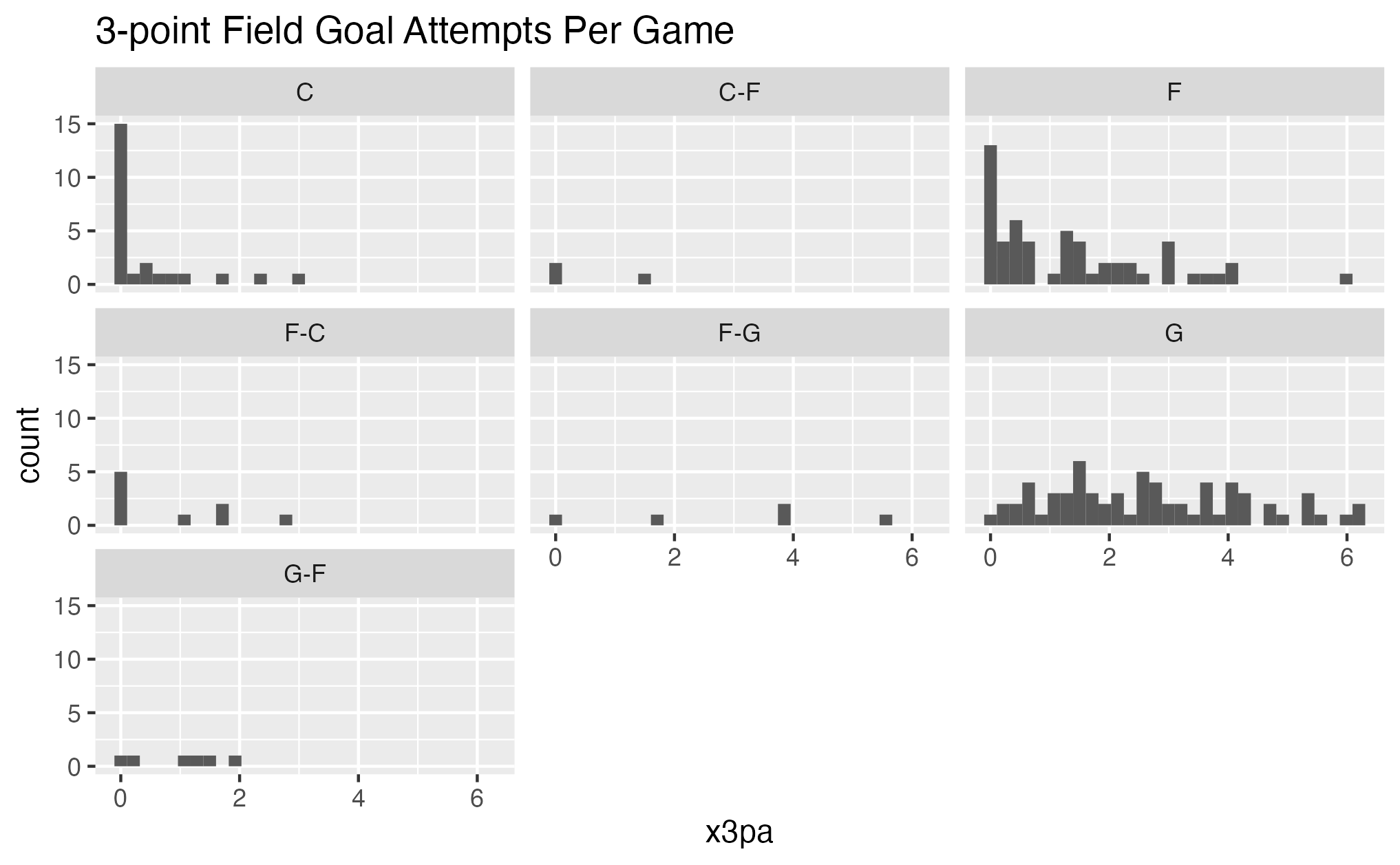
Histogram with facet_wrap.
The after times
Now, there is nothing wrong with histograms; depending on the situation, that may be exactly what you need. But for the way I like to process information and not deal with figuring out what size bin makes the most sense for the data, a lovely density plot is the way to go. Here is another way to look at the same information:
# I am adding a y variable here
ggplot(wnba_2019_per_game_stats, aes(x = x3pa, y = pos)) +
  # and I am changing the plot type here
  geom_density_ridges() +
  labs(title = "3-Point Field Goal Attempts Per Game")
Running that gets you this plot:
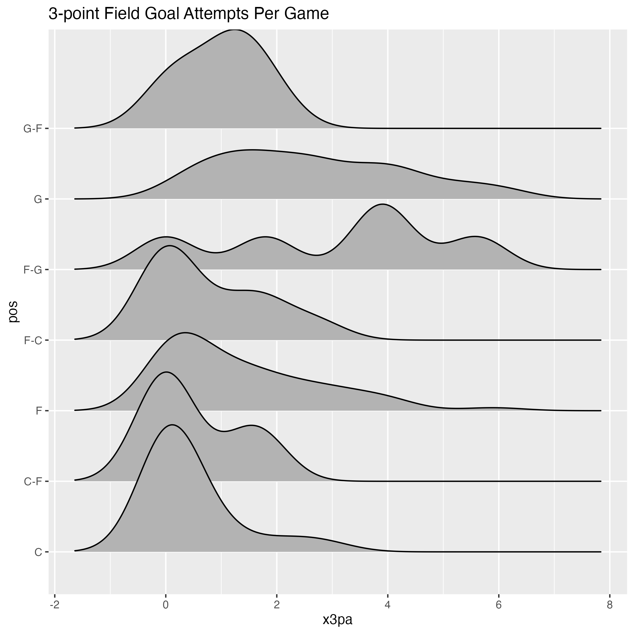
Density plots.
Without much of a lift, I can tell the differences in 3-point attempts by position much easier with this plot.
Scenario #5
You are working out of a rmarkdown or quarto document in your R project, creating some beautiful plots. You are showing your work to someone, and they ask, “Can I get a copy of that plot?” And you are glad they love it and are ready to share your work.
The before times
For the longest time, when I needed to share a plot, I would take a screenshot and send it that way. It never occurred to me to see if there is an easier way to save a plot. The screenshot was easy enough. I would take the picture, find the files on my desktop where all my screenshots went, ensure I got the most recent one and not one of the other million screenshots, and then send the file to whomever. Sometimes I would save the file to my projects folder in case I needed it again later. What can I say? It got me where I needed to go. 🙃
The after times
I recently learned that ggsave exists! LOL 😅 Now I don’t have to do so many steps to send someone an image of a plot. I can run ggsave after creating my plot, choose where I want to save it (which, since I work in R projects, it would go to that folder), find the file safely there with the name I chose, and send it along. Here is what it looks like:
density_plot <- ggplot(wnba_2019_per_game_stats, aes(x = x3pa, y = pos)) +
  geom_density_ridges() +
  labs(title = "3-Point Field Goal Attempts Per Game")

# This is the new line to save the plot
ggsave("Outputs/scenario_5_density_plot.png")
Scenario #6
Someone asks you to create a presentation, and a good portion of your work is in R. Sometimes, you may need to share some code. Other times you may need to share only results, or you need to make a slide deck for any old reason. You are not interested in opening up PowerPoint or Google Slides.
The before times
When first learning about R, I heard I could make slides, but I ran far away from trying because I felt like it would take me so much longer to figure out how to do not and get the slide deck done in time. So I would do all of my work in a markdown and copy and paste pieces into my slide deck.
The after times
I would be lying if I said every time I need to make a slide deck, I do it in R, but on occasion, now I have embraced it. The last slide deck I created in R and shared was for the
2022 NYC Open Data Week. And now that Quarto exists, I have also tried making slides with that tool. You can check out scenario_6.qmd file in the repo on how you can adjust the formatting of the scenario_4.qmd file into a simple slide deck.
See you next time
May your days be lighter and brighter in this next season. ☺️